Korean Air Rebranding Case Study
After reading the articles about the new CI of Korean Air, I was quite shocked how bland it looked compared to the previous visual identity. The entire visuals went too hard with the minimalism and converted the brand image flat.
As a Korean and a graphic designer, this stirred a passion in me to create my own rebranding that can both emphasize the Korean heritage and enforce the brand identity as a new Korean powerhouse in industry. I feel very proud with what I’ve created for this case study and would love to work on more projects like this!
Project Type
Branding & Identity
Logo Design
Brand Guideline
Role
Art Director
Designer
Adobe Photoshop
Adobe Illustrator
Adobe InDesign
Procreate
Tools
Year
2025
I started out with creating sketches while looking through the brand visuals from Asiana Airlines and Korean Air. The biggest off point for me was the lack of traditional Korean aesthetics that both airlines held before the merge.
But another challenge was to find another traditional aspect from Korean culture. Since this is a merge of two airlines, it was crucial to present the new beginning via design.

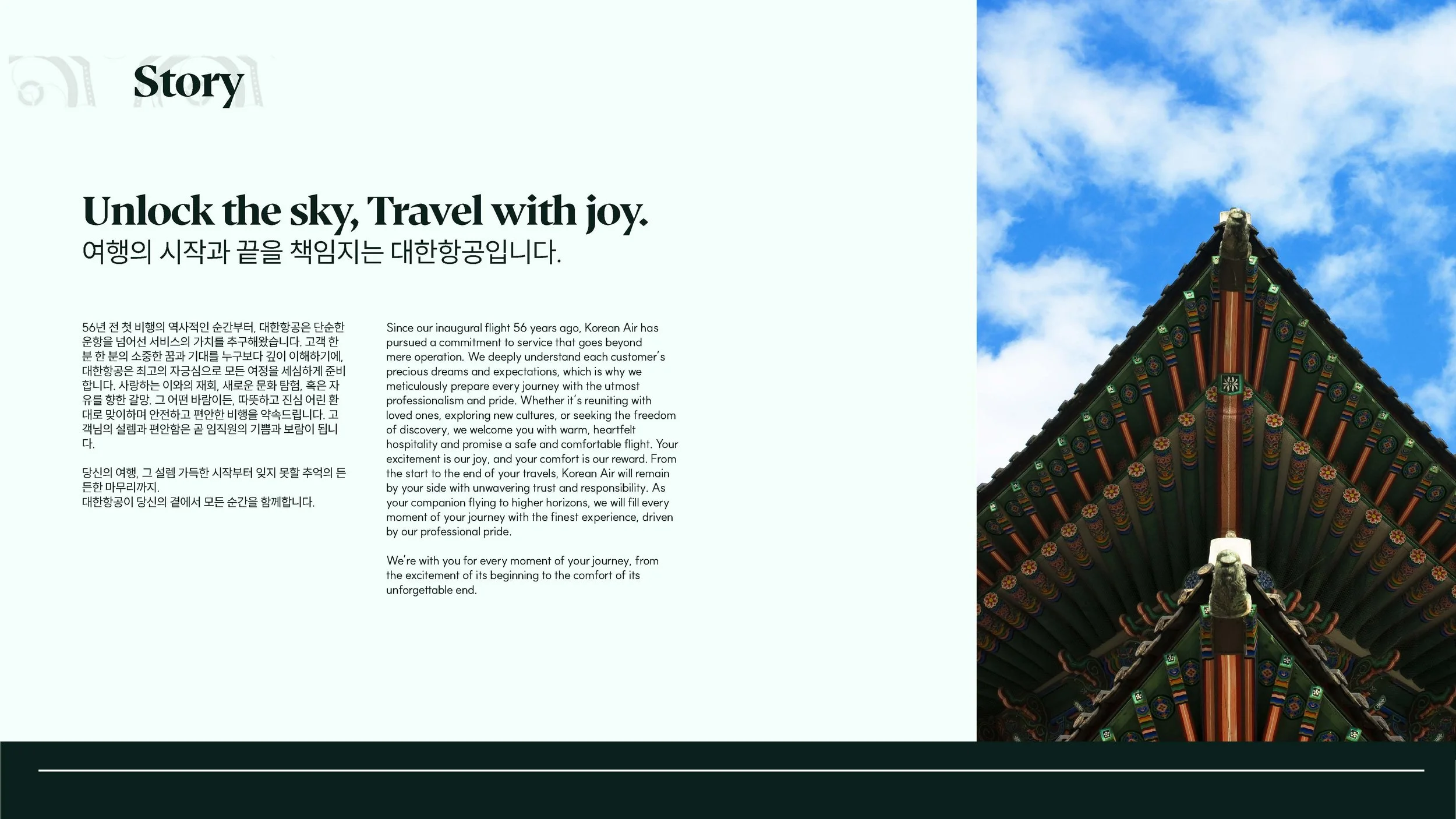
So I decided to pick “dancheong”, a traditional Korean decorative coloring technique found on wooden buildings, especially temples and palaces.
The main purpose of “dancheong” is to help protect the wood from natural hazards such as insects and weather, making the buildings last longer. It uses a specific set of five main colors (blue, red, black, white, and yellow) to create beautiful, intricate designs that are very distinctive.
It is also designed to go along in a timeless manner. Whether they sky is bright or dark, sunny or gloomy, “dancheong” blends in with its vivid colors. This aspect really stood out to me and thought it could be tied into Korean Air’s brand identity. A traditional design that stand out in any condition of the sky and an airlines company that flies multiple nations across the sky.