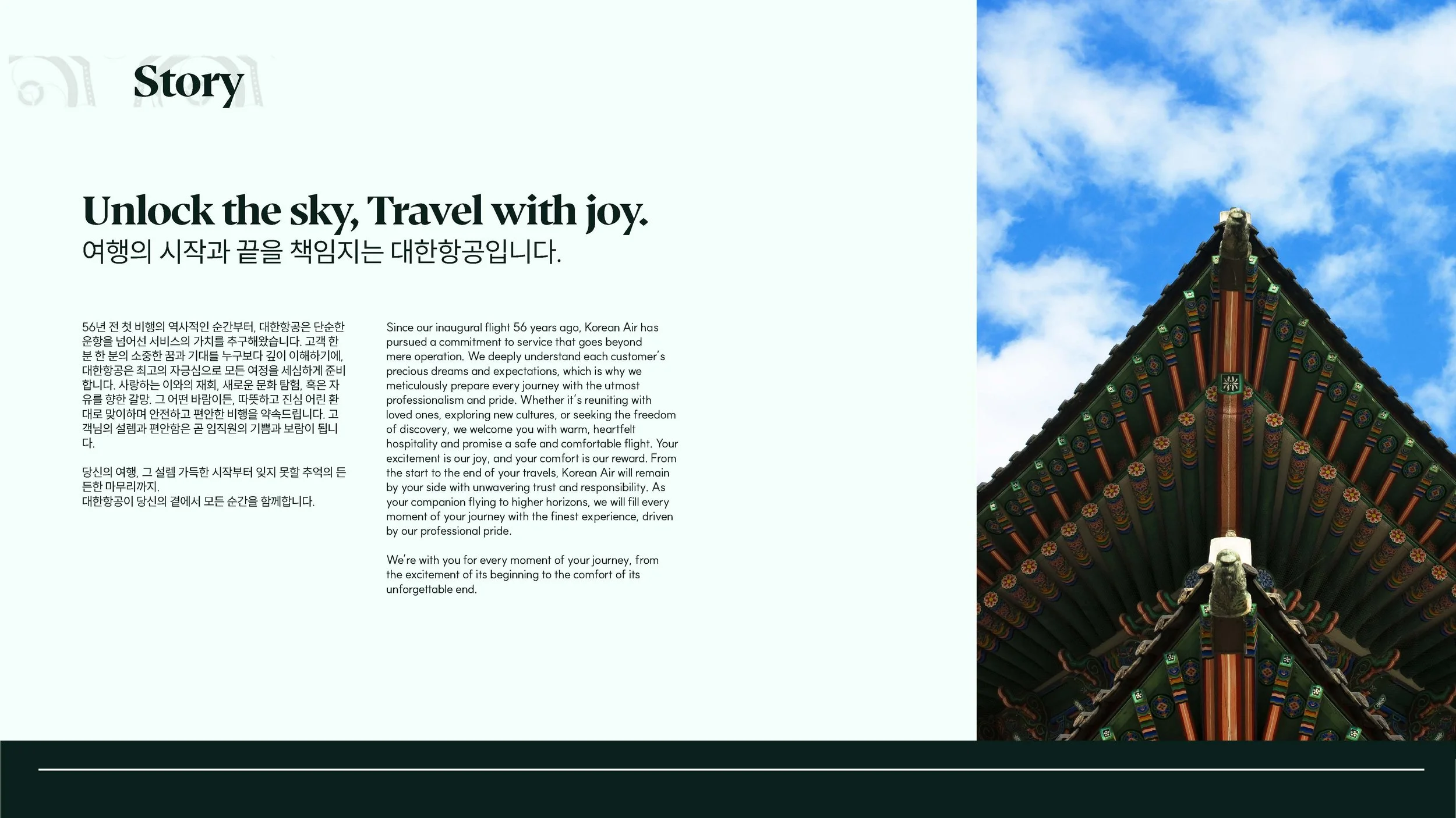
Korean Air Rebranding Case Study
Upon reviewing recent articles discussing Korean Air's new corporate identity, I identified an opportunity to explore alternative design approaches that could better balance contemporary aesthetics with cultural authenticity. While the current rebrand embraces minimalist design principles, I believe there's potential to create a visual identity that more effectively communicates both Korean heritage and the airline's position as a leading industry innovator.
Branding & Identity
Concept Development
Design Research

Celebrates and integrates Korean cultural elements in a sophisticated, modern context
Strengthens brand recognition while positioning Korean Air as a global industry leader
Demonstrates how minimalist design can coexist with cultural richness and visual impact
As both a Korean designer and someone passionate about preserving cultural identity in global branding, this project represents a meaningful intersection of my professional expertise and personal heritage. The opportunity to reimagine how Korean Air could present itself to the world has been both challenging and deeply rewarding.
This initiative aims to develop a comprehensive rebranding concept that:
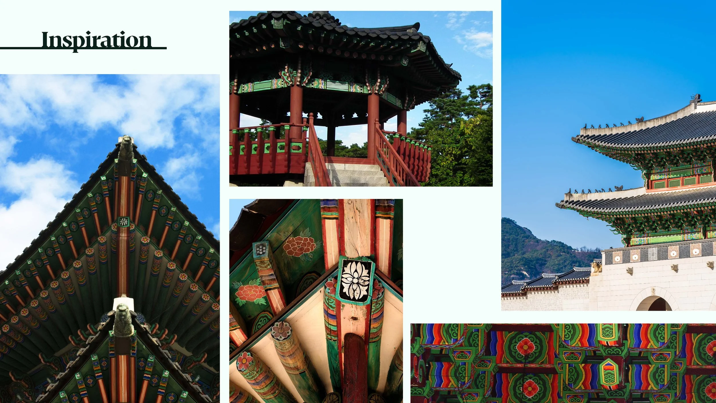
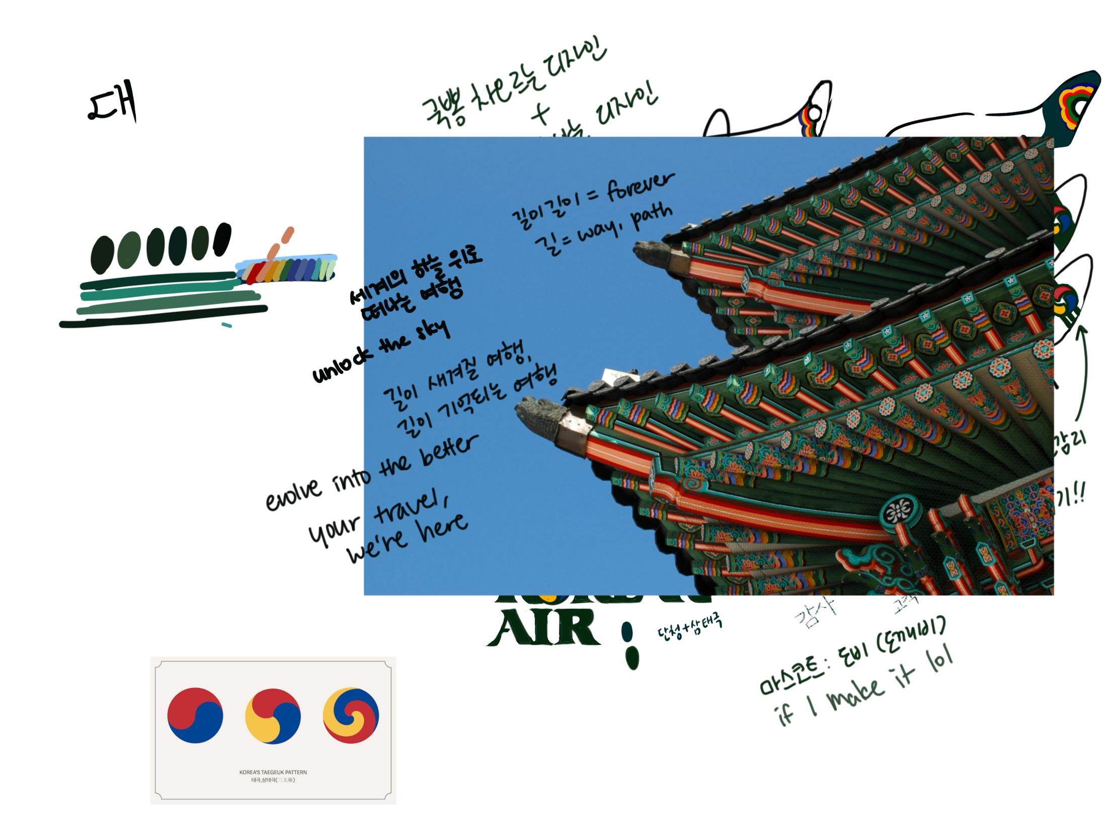
After extensive research into Korean cultural traditions, I identified "dancheong" as the conceptual foundation for this rebrand. Dancheong is a traditional Korean decorative coloring technique predominantly found on wooden architectural elements of temples and palaces. This art form serves both functional and aesthetic purposes—protecting wood from natural elements while creating visually striking, intricate patterns.
The technique employs five primary colors: blue, red, black, white, and yellow, which create distinctive designs that maintain their visual impact across varying environmental conditions. Whether against bright or overcast skies, dancheong's vibrant palette ensures consistent visibility and recognition.